

Representing a home online comes with great responsibility.
A picture is worth a thousand words, but your UX, copy, and overall brand identity need to speak for themselves too.
The lead conversion factor in real estate website design is trust.
Put your best online footprint forward to attract attention and get prospective buyers.
It's a politely mixed concoction of form and function.
As a real estate agent, your site is your social proof.
Coordinate personable, valuable information, with an easy-to-use interface for a smooth and direct user experience.
If you're struggling with website design inspiration, here are 24 examples we think you'll love.
Plus, tips on what makes them work and sell as strongly as they do.
What matters most for real estate web design?
Don't shell out thousands of dollars to design your stunning real estate website without first asking yourself these three questions:
- What are the goals for the website?
- How much time and money am I willing to invest in the website design?
- What real estate content will be displayed on the website and how easy is it to update?
Once you answer these questions, you'll arrive at a ballpark price estimate that (hopefully) meets your expectations.
No disappointment or price shock!
Website design key facts and statistics you should know
- The probability of bounce increases 32% as page load time goes from 1 second to 3 seconds1.
- A site that loads in 1 second has a conversion rate 3x higher than a site that loads in 5 seconds.2
- Nearly 70% of consumers admit that page speed impacts their willingness to buy from an online retailer.3
- Today, even though most web traffic occurs on 4G instead of 3G, the majority of mobile sites are still slow and bloated due to too many page elements.4
A list of website designs we love.
Below we've listed 24 gorgeous examples of websites in the real estate business.
We've produced this list based on design, feel, font choices, colors and, functionality.
If you need inspiration for your next website, this is it!
1. Oyler Hines
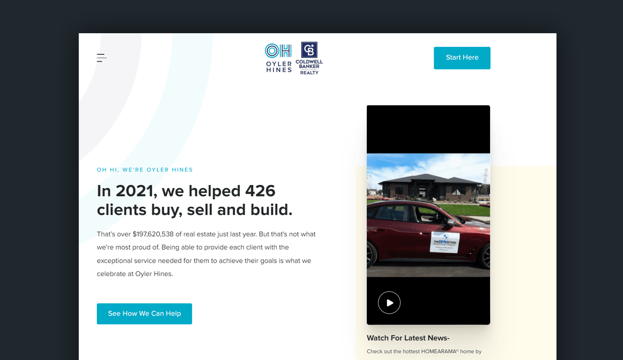
Within seconds, website visitors are graced by results and social proof.
426 clients and $197,620,538 of successful real estate services later, it's clear Oyler Hines is a hegemon in the market.
But it doesn't stop there.
As you navigate their home page, the trust builds with:
- Personable client testimonials
- Video evidence and explainers
- Detailed breakdowns of the process from the initial interaction to closing signatures.
The services Olyer Hines offer are clearly defined; buy, sell, build.
Each workflow is transparent and publicly consumable.
The lead capture forms aren't tedious, minimizing onboarding lag by asking the right questions.
The site boasts a modern design with luxury font elements, eccentric photos, floor plans, interactive maps, and similar property matching.
2. Ryan Serhant

Ryan Serhant is an actual person and a reputable luxury real estate brand operating out of New York.
We know. He's on every real estate list ever. But, there's a good reason.
Ryan understands the essential elements that a real estate website needs for more leads.
His site provides his backstory.
Meanwhile, the brokerage site screams luxury and status.
There's no doubt Serhant Brokerage is a staple of the finer things in life; class, luxury, and modern real estate.
Its direct visualization of success.
What we love about his homepage:
- Vibrant, high-quality imagery.
- Each featured listing section is user-friendly.
- Personal touches include distance to museums, dog parks, and Michelin-rated restaurants.
These amplified listings target specific geo-data that are vital to luxury home buyers.
The Serhant Brokerage site has admirable, standout features; every listing is detailed in coordination with the Serhant Lifestyle Index:
Pets. Culture. Culinary. Wellness.
It's no wonder they hold authority in the New York City market!
3. Speicher Group
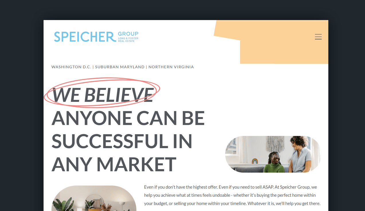
Speicher appeals to the middle-class market with reassuring statements and personable pain point solutions.
It feels like you're in good hands.
Other real estate websites chatter about how they'll sell your home, littered with glitz and glam.
Speicher says, "We won't lie-it's a difficult process, but we will be with you every single step of the way."
It's a great display of how copywriting can speak directly to an audience and help a real estate agent generate more listings.
What we love about this website:
- Clean, modern design.
- Powerful examples of copywriting.
- Easy-to-identify call-to-actions.
- The page animations as you navigate on any device.
- Fantastic choice of fonts to make the content stand out well.
When you hire a Speicher real estate agent, you hire their entire team. No pressure. No stress. Only happy house-hunting and selling.
Other features that make this a great website:
- When browsing individual homes, potential clients can send an immediate request for an in-person or virtual tour.
- The listing page is user-friendly, with a grid layout of information and insight into the local lifestyle/demographics.
No questions.
And customers love that!

4. The Coley Group
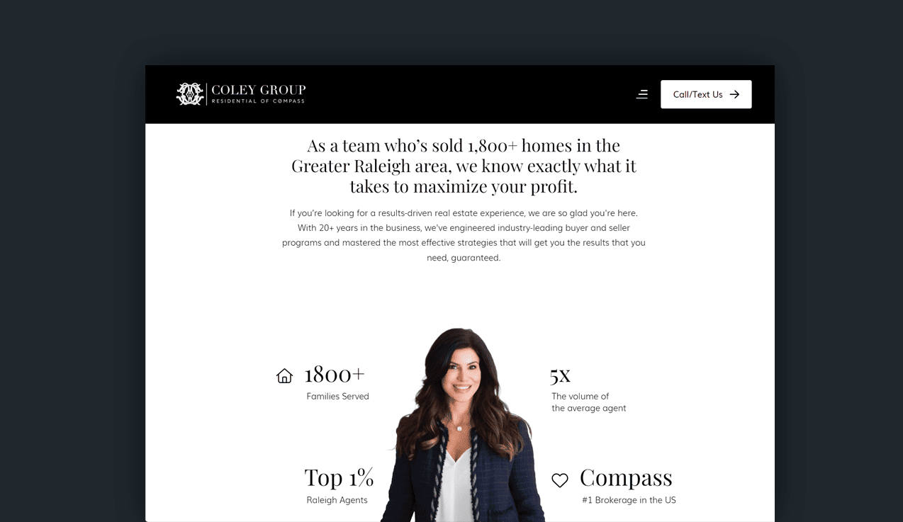
Gretchen Coley has mastered the art of focusing on what home sellers care about most.
Their property and their profit.
Potential clients are greeted with a welcoming smile from Gretchen. Accompanied by the kind of social proof that generates inquiries.
The site’s navigation is a full-screen experience.
It highlights the most important areas of the site in such a way that feels like home. It’s not a hard sell.
Each menu item is neatly categorized by intent, i.e., do you want to buy, sell or learn more about the neighborhood?
What we love:
- The color scheme is fresh and modern.
- Clever use of video content without impacting page speed.
- Great copywriting as users scroll through the page.
- The subtle animations reveal new content.
The user experience is seamless on both desktop and mobile.
We love everything about Gretchen’s site!
5. The Joe Taylor Group
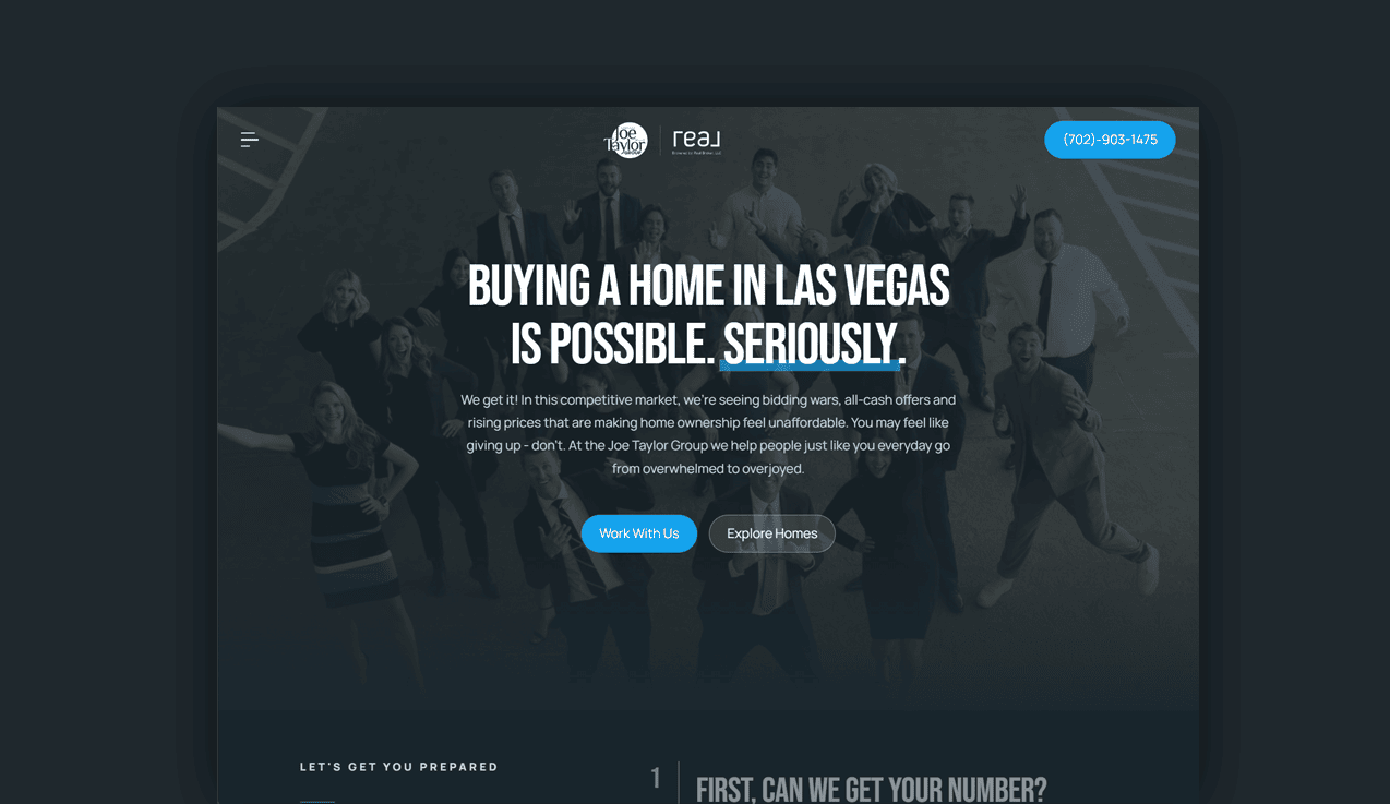
The Joe Taylor Group has a unique, standout website design.
It’s brilliant.
From the subtle gradient overlays in the header images to the standout call-to-actions. It’s a smooth mix of professional fonts and a masterclass in sales copywriting.
These guys have managed to create energy with their design.
You can almost feel the positivity beyond your screen.
Nobody wants a sad real estate agent, right?
What we love about this design:
- The hover animations as you scroll through the parallax design.
- How personal the entire website feels.
- The image carousel shows how successful their marketing has been.
- The fantastic use of Instagram at the bottom of the homepage.
- An unreal combination of fonts and colors.
It feels like a billion dollars.
A truly phenomenal display of UX and design.
6. Park Group Real Estate
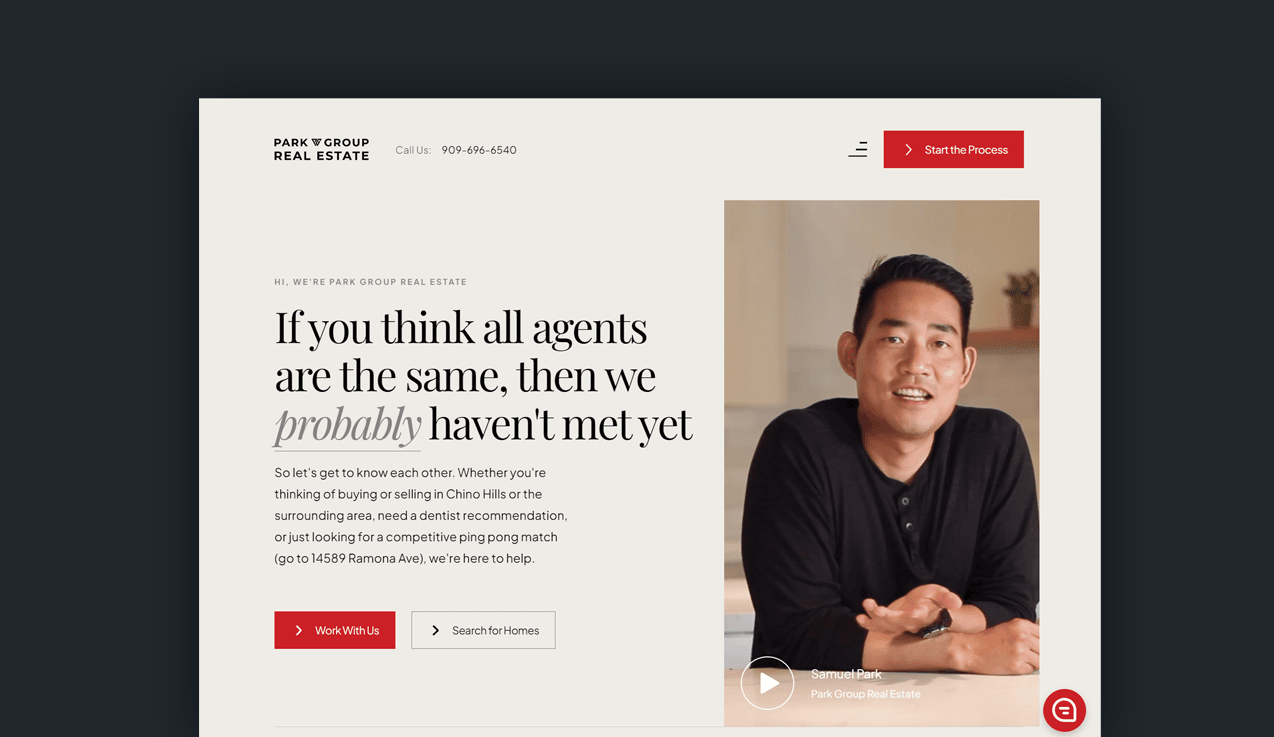
Sam Park’s website makes you feel warm.
Using color psychology, he’s combined the warmth of cream with the passion of red for his call-to-actions.
There isn’t any way a potential client could miss them.
Your call to action should always stand out from the page. And, in Sam’s case, he’s done just that. Users have three opportunities to engage with him. As you scroll through, the chat function is sticky.
A brilliant way to increase engagement (and generate leads).
What we really love about this website:
- The header video.
- The color scheme and choice of luxurious font.
- The plethora of neighborhood content and landing pages.
- The animations on the scroll are kept short and sweet.
Sam has nailed the sense of warmth home sellers and buyers desire.
He shouts about himself but in a subtle way that’s not distasteful or disruptive.
It’s a brilliant example of how agents can soft-sell their way into a client’s mind.
7. Tammi Montgomery
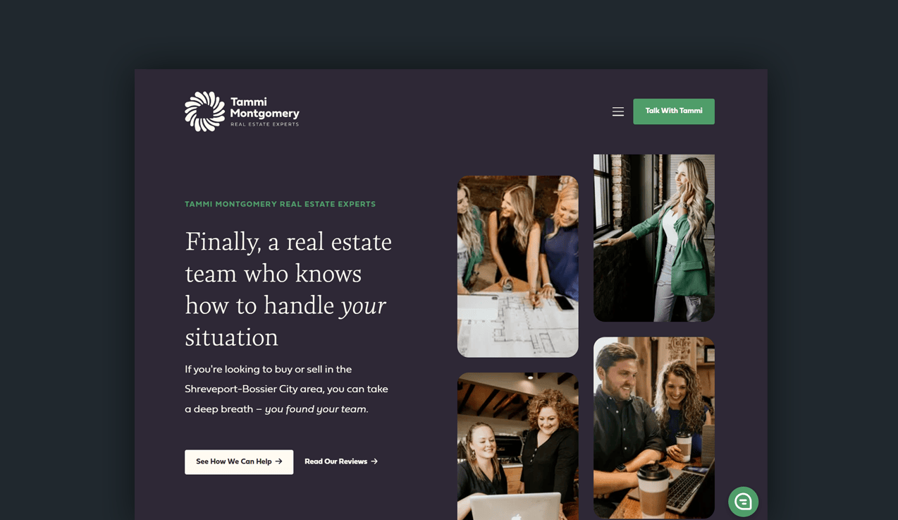
Tammi Montgomery has the best color scheme out of all the website designs we’ve seen.
Purple and green are two of the most sought-after combinations in web design.
Why?
One instills trust; the other represents intelligence.
Two traits that all home sellers want their real estate agents to have. Tammi’s managed to communicate that with her homepage without saying a word.
That’s how copywriting works. You get your message across without having to really say it.
Brilliant.
What we love about Tammi’s website:
- The clever imagery in the hero image of the homepage.
- A personal and tasteful call-to-action in the website’s header.
- The use of social proofing beneath the fold.
- How responsive the design is on mobile.
- The funnel Tammi creates for buying and selling.
Hats off to Tammi’s web designers.
They know a thing or two about making websites work for real estate agents.
8. Saslove & Warwick
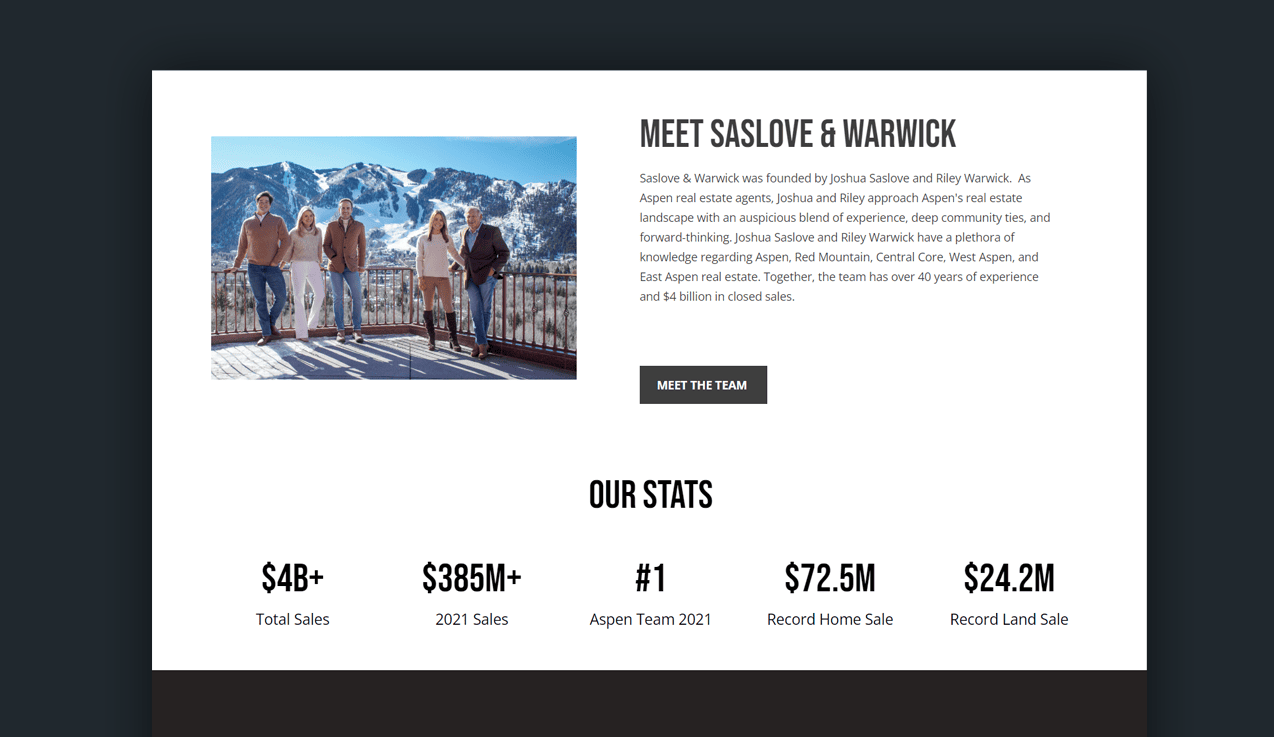
Saslove & Warwick have made a name for themselves in the chilly Aspen real estate market.
The site's color schemes suitably match the mountain-living imagery and videos.
Potential clients can meet the team, a charming set of people gracing a snowy mountain scape. Click through to read personalized bios and follow them on their social media platforms.
It's more than welcomed and helps put a face and personality to the portrait.
Also, check out a related article to read a success story.
As Saslove & Warwick markets as Aspen's luxury real estate team, their website backs this claim.
If the site were to dress, it would be decked out in snow gear, readily embracing the fresh move to Colorado's gorgeous summit range.
Property listings are brief; without the fluff.
It's simple to contact them about any listed property with a click.
What could be better?
One downside to this real estate website is that property listings don't have an interactive map.
Instead, Saslove & Warwick attach a screenshot of the location and its surroundings. Their loading speeds are top-notch, though!
9. Tim Allen
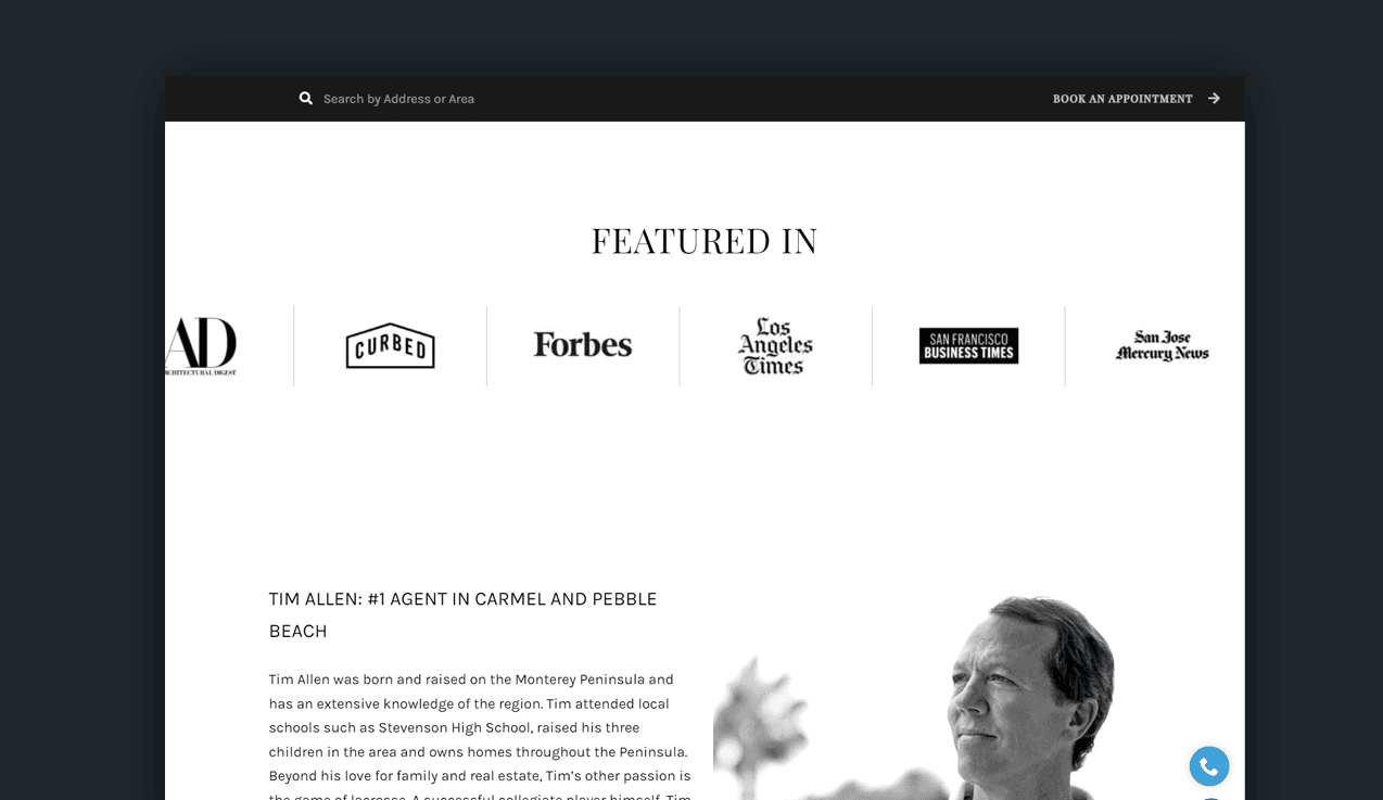
Tim's photography on his site is taken for his business; no stock imagery is allowed.
This boosts personality and trust and adds flare to his listings.
It's not just black and white; the space between matters too.
Tim Allen's site is an example of a great real estate website because of its captivating imagery, videography, and connection.
Customers can watch videos of previous home sales, case studies, and testimonials. He services a few areas with heightened location-based expertise so home buyers can make the best lifestyle decisions.
Browse beachfront estates, discreet listings, and the best of the best luxury property in Pebble Beach.
There is a breathtaking video tour of each property, helping homebuyers visualize themselves drinking a cup of tea from their new space.
You won't be served all the local market demographics or map specifics, but each district has a neighborhood guide.
10. Aaron Kirman
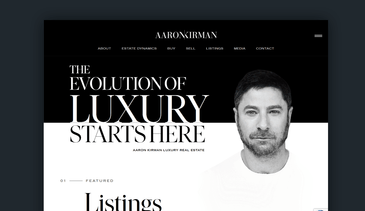
Instantly putting a face to the luxury site pumps credibility and trust. It's compelling and shows complete control over his site and brand.
What we love about Aaron's site:
- Subtle animations to guide users through a gallery of luxury homes
- Gorgeous imagery
- Flawless design.
- Color schemes position him as a luxury agent.
- Great choice of font combinations and header hierarchy.
Everything is incredibly well done.
He offers an e-book on Luxury Real Estate Forecasting, which is helpful for agents, buyers, or external property managers.
This is a great example of how lead magnets work for real estate.
The free value from the website empowers clients to book a call with him.
The site is modern, luxurious, wealthy, and clean, organized with white space, grid layouts of featured listings, and aligned brand schematics.
11. Home Sweet Heidi
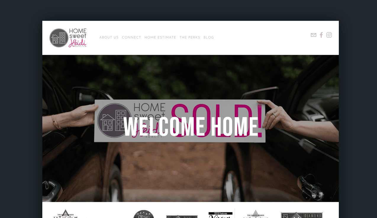
This homegrown real estate agency is full of warmth and southern charm.
It's woman-owned, and the design elements follow suit.
In contrast to other real estate agencies, Home Sweet Heidi is all about personality and value.
What we love about this website design:
- Immediate call-to-action for a home evaluation.
- Related articles for geo-specific content for the area.
- Videos introducing the team to potential clients.
Home Sweet Heidi's webpage has their Instagram synced so newcomers can follow their home successes on other social media platforms.
Although the page is personable, upbeat, and lighthearted- it's not a one-stop shop for someone looking for quick answers.
Now, this could be both positive and negative.
If a prospect falls in love with their site and brand, they may reach out to inquire about properties. Since HSH does not directly link to their listings, securing leads requires a bit more effort.
Generating leads is the lifeblood of any real estate business. So it's crucial to build a solid lead funnel on your website.
Other than that, great job Heidi and team!
12. The Eklund & Gomes Team

Another real estate powerhouse: Eklund and Gomes.
They've understood the assignment.
A great real estate website should capture leads. One simple way to do this is by using an email sign-up. This could help real estate agents build a list of email subscribers with whom they can continue to build relationships.
What we love:
- Lead-focused.
- Clean design with vibrant imagery.
- Easy-to-use website navigation.
Even if you're not buying or selling a home, there is a wealth of valuable information on this site, such as market reports, neighborhood guides, buying/renting guides, relocation services, and other quality content.
Providing value for free tells potential clients that you can walk the walk.
Listings are easily browsable in a grid layout with square images and cliff notes on the property.
Some homes offer a street-view tour of the estate and the neighborhood, although it takes a while to load.
13. The Jill Zeder Group

The font choice for Jill Zeder Group sums up Miami vividly. The elongated lettering is a mixture of high-class comfort and beach vibes.
Homepage imagery backs this up by presenting Miami as a lifestyle, not just a destination.
The quick search function lets users scope out the potential in a breeze. There's a clear funnel to action.
The website's design is smooth, sultry, and suave. Subtle animations flow in and out to present Miami's best properties.
The three palm trees are featured throughout the whole real estate site to keep the branding cohesive and melodic.
Before you book a call, there are attractive neighborhood guides and maps of the areas. Instead of just a basic listing platform, the submenus have additional resources to educate users on market trends, lifestyle-matched locations, and more.
What we love:
- The font choices are incredibly well done.
- The wealth of content available to potential buyers and sellers.
- Interactive guides and maps of the area.
- Focusing on the feel of real estate; rather than the process.
14. Squarefoot
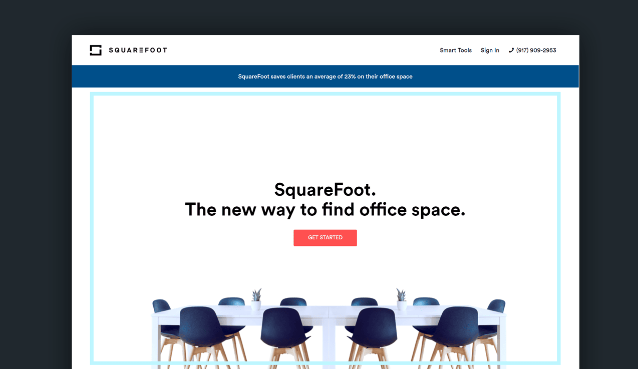
SquareFoot did an amazing job with its branding.
Their name alone communicates a vague idea of their services and products. "A new way to find office space."
Easy, effortless, clear. Everything is respectfully direct and to the point; no fancy fonts or animations are needed.
Right away, prospects are informed that SquareFoot's clients save an average of 23% on their office space.
Who doesn't like saving money? Hence, interests are piqued.
There's no header menu for listings and resources; you must scroll a bit down the page to click on any other CTAs.
This is good as customers are more likely to skim the material. Newbies cannot immediately access listings; users must fill out a short questionnaire on their needs to be matched with the best spaces.
What we think could be better:
- Content plays a huge role in real estate SEO, so we think there should be more.
- The clean look is great, but it can be frustrating for users.
- Not having website navigation is a big no-no for real estate website design.
Overall, the site isn't flashy or pretentious. It's concise, neat, and organized, just like the perfect office should be.
15. Sharlene Chang
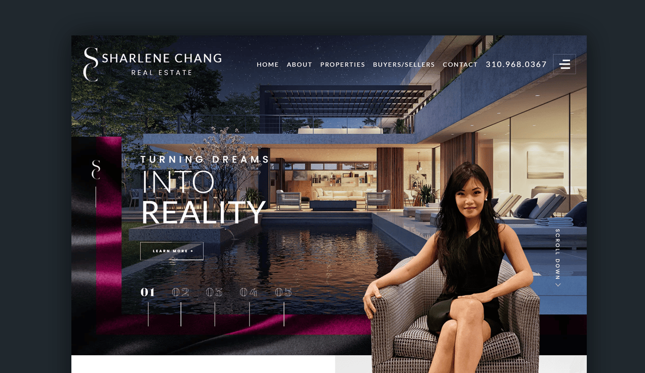
Inspiration taglines are the rage for highly selling real estate agency sites, and Sharlene Change serves up a slice of L.A. in her delivery.
Her company is modeling the Los Angeles color themes, nightlife vibe, and overall class by the way she presents herself and her properties.
Unique to Miss Chang's site is an interactive map of the area, easily clickable to explore the draws of the different districts.
Potential clients scoping out a set neighborhood saves a lot of time.
Her site moves smoothly as you navigate the user interface. The only aspect that needs a bit of improvement is the photo quality; however, the site performs, loads, and works as designed.
16. Iconic House
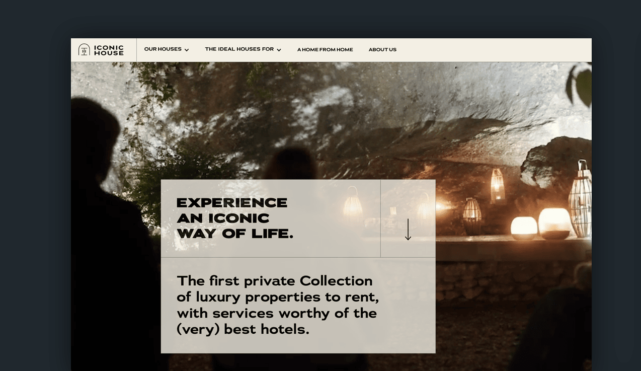
This real estate company focuses on matching customers' personalities to their ideal home away from home, a luxury long-term hotel stay.
Playing the part effortlessly, the landing page captivates attention with exotic experiences such as cave meditations, wine near the cliffs, and group yoga classes.
Hats off to the web designer.
The whole website looks straight out of National Geographic's Vacation Special.
Iconic Home has three prominently featured listings in the mountains, next to the ocean, and deep in the alpines. The way the listings are presented looks like an entrance ticket to a whirlwind of adventure, dripping in luxury and memories.
Since it is a hotel and vacation rental site, they're not confined to fair housing laws, so visitors can choose between stays designed for work, seminars, families, or getaways.
17. Carter+Co
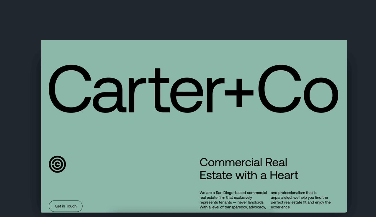
Most of the other websites on this list feature flashy imagery or slow-motion videos of the real estate agency's base location; Carter + Co keeps it simple.
Rather than jump right into featured listings or smoke and mirrors, Carter + Co plays it straight.
They appeal to a customer's ethos by advocating for transparency in the real estate industry.
No run-arounds, price-gouging, or secret weapons are coming your way when you hire them.
The plethora of companies they've partnered with backs up their credibility. Everything on the site describes how working with them benefits the home buying and selling process.
As modernly designed and neat as the website is, it lacks a listing database or any foreshadowing of their homes showcasing. This prompts users to make a call, generating an organic lead.
18. Sage Homes
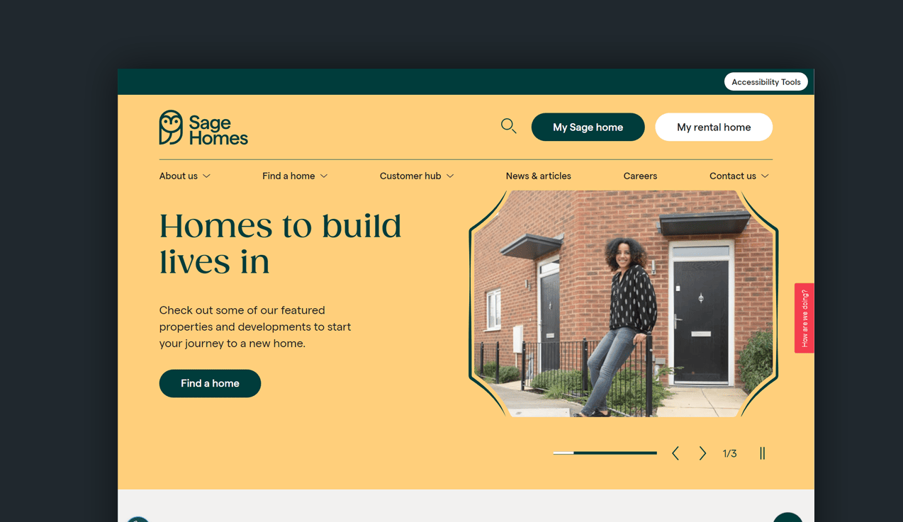
Renting a home can be a tedious, exhausting process. Sage Homes look like they've changed that.
The warm coloring on their site is welcoming and tranquil. It doesn't promote luxury or region-specific tastes; rather, a comprehensive, light-hearted solution to renting your next humble abode.
Every week they feature a fresh assortment of prominent listings curated by the agents themselves.
Sage Homes has concrete trust in their site with access to valuable information, like shared ownership of flats and properties.
Having an "advice hub" makes newcomers feel like you're not gatekeeping secrets. People are more likely to trust your business when you answer questions before they come up naturally.
What we love:
- Fantastic choice of colors.
- Personable and warm imagery.
- The copywriting creates a sense of urgency but isn't too pushy.
- The amount of content provided about real estate.
19. The Jills
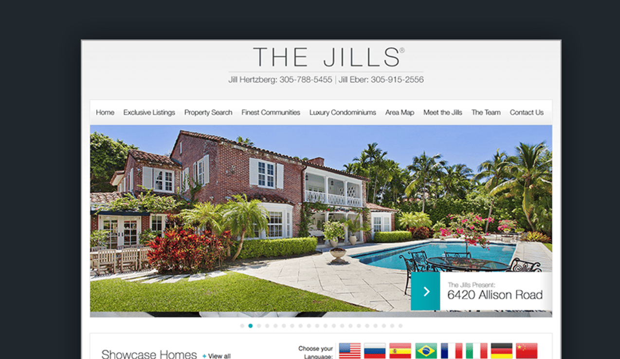
The women-duo leads with authority by offering their site in 5+ languages.
It’s one of the more universally functioning sites on this list.
The search functions, categorized informational menus, and showcased homes are front-page news, so finding exactly what you’re looking for is a total breeze.
We've included The Jills Real Estate for this reason: their ability to cater to multiple languages.
What do we think could be better?
For a landing page, it’s all-inclusive but doesn’t drive personality or trust. It has a slightly dated feel to the design.
It looks and feels like an HTML website.
There’s no human presence easily accessible until prospects reach out. For real estate agents, being personable is part of the job.
Brokerages and large real estate enterprises benefit from this website design as it’s convertible, accessible, and multi-functional.
Some may find it too identical to an agent’s MLS.
20. Keri White Team
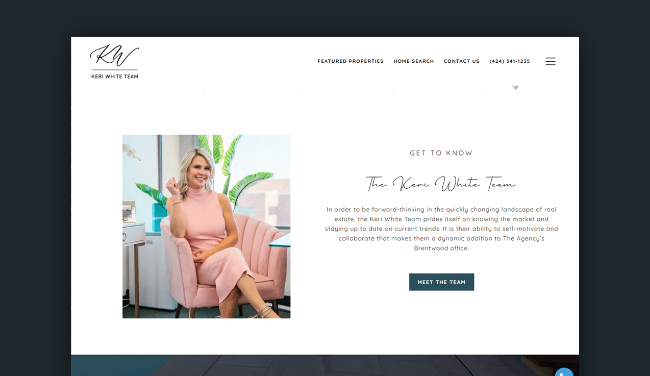
Keri nixed the copy and sales language to market her site around a personal brand image.
The header video features locations around her sales zone and a brief introduction to Keri herself.
After connecting with the human face of the Keri White Team, site visitors are treated to various forms of real estate information.
Choose from webinars, blogs, or Keri’s very own, KeriTV.
The behind-the-scenes videography is transparent and light. Keri discusses the ins and out of the current market, featured homes, and her successful sales processes.
She comes off as a key player in the industry who you can trust.
Instead of cluttering the sticky menu, she leaves her three main CTAs (call-to-actions) for follow-through. Search a home directly, browse luxury featured listings, or hop on a call. The secondary drop-down menu is value-rich with blogs and media details.
What we love about this real estate website design:
- Secondary drop-down menus for easy navigation.
- Listing features and search function.
- 'As seen in' logos on the homepage to instill trust.
21. Strike
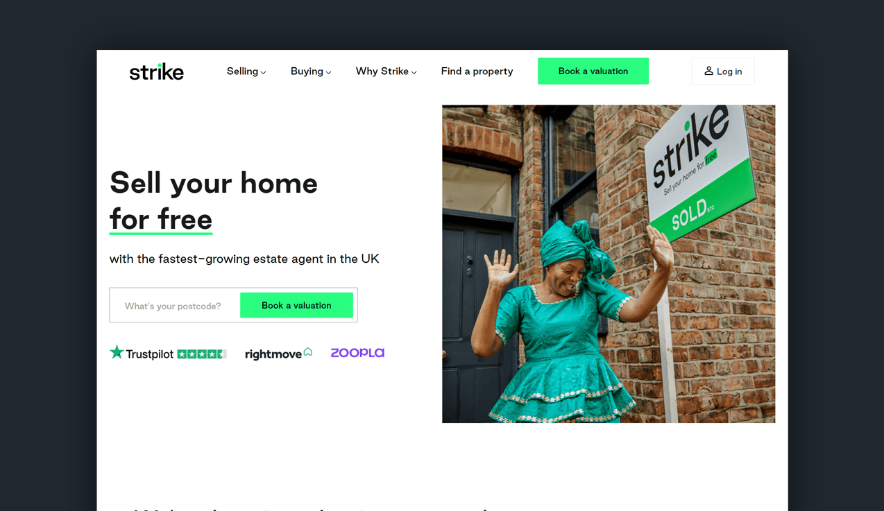
Strike’s tagline raises the roof in a direct response copy.
Let's take a page from our real estate agents across the pond.
Drama-free, affordable solutions to the home selling process?
Sign us up.
As you traverse the site, your confidence is solidified with social proof and statistics; “628 viewings every day, that’s one viewing every minute.”
They’re selling high odds at visibility and reach: two leading factors in a speedy home sale.
In color theory, green is the color of harmony.
It represents tranquility which is seldom a denominator in the home buying/selling process.
CTAs are written throughout the copy not to confuse new site visitors.
There’s a lot of text on the landing page, but all of it has value to new customers wanting to see their agent’s big picture.
What we love about this real estate website:
- Standout color choice.
- Powerful copywriting to engage users.
- An amazing brand-able logo that's easy to recognize.
- Social proofing is above the fold (always great for conversions).
22. Sandro Dazzan
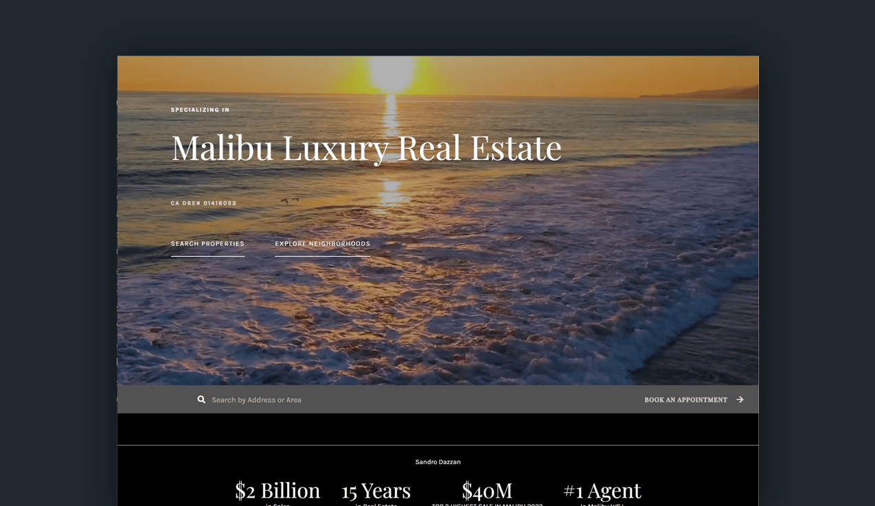
Your site should detail what you do and how well you do it in seconds.
People don’t lag on pages for long, especially when conducting competitor research.
Sandro Dazzan’s page is minimalist and direct.
The typeface is crisp and pairs well with the secondary fonts.
Having two main options on the landing page to search properties or explore neighborhoods opens the door to his location of expertise without batting around the bush.
His agent bio is the next section of text after the header, appearing classy and intelligent in his field.
The personal details are focused on real estate outcomes tailored to results-only language.
On other popular real estate agency websites, you might have seen this layout before, but it’s never been done as tastefully as Sandro’s.
One last bit of praise is his CTA that follows customers down the page.
It’s not the same as the sticky header menu, so it catches attention. Whenever a prospect sees a result that resonates with them, scheduling a chat is a click away.
23. Steelwave
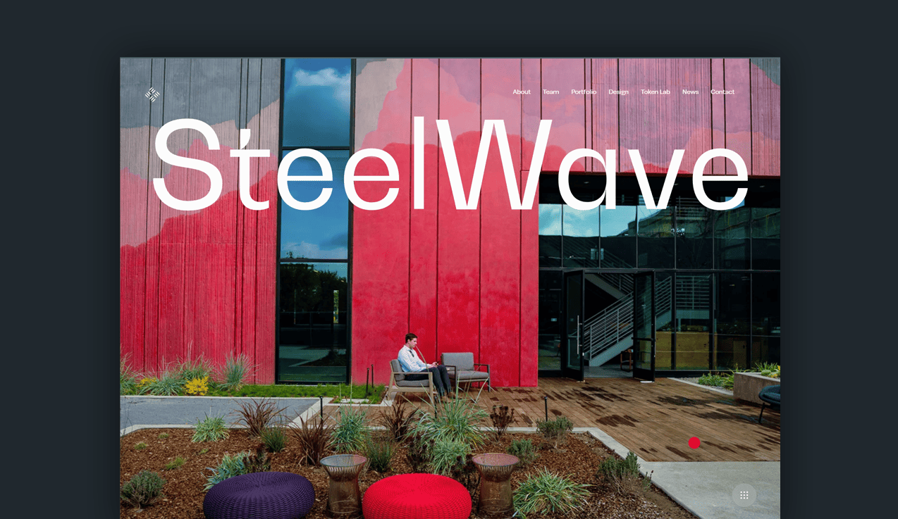
This mixed media site is a refreshing experience in real estate shopping.
It features elevated typography, animations, scrolling sticky text, and cursor thematic.
There’s no connection to the run-of-the-mill home buying websites as everything here seems curated by an art designer.
The photography makes delightful use of white space.
It dances around the text playfully with an innovative spin on formality. Steelwave is futuristic, bold, and not here to play any games.
Other real estate websites could take a lesson or two from this design.
With all of these advanced-level moving parts, the loading speed doesn’t waver.
There are tens of components that set a whole new expectation in online real estate browsing, such as VR home tours.
Steelwave has deep connections within the Web3 space, offering additional opportunities for brand and property investment in their Token Lab.
24. Gizmo
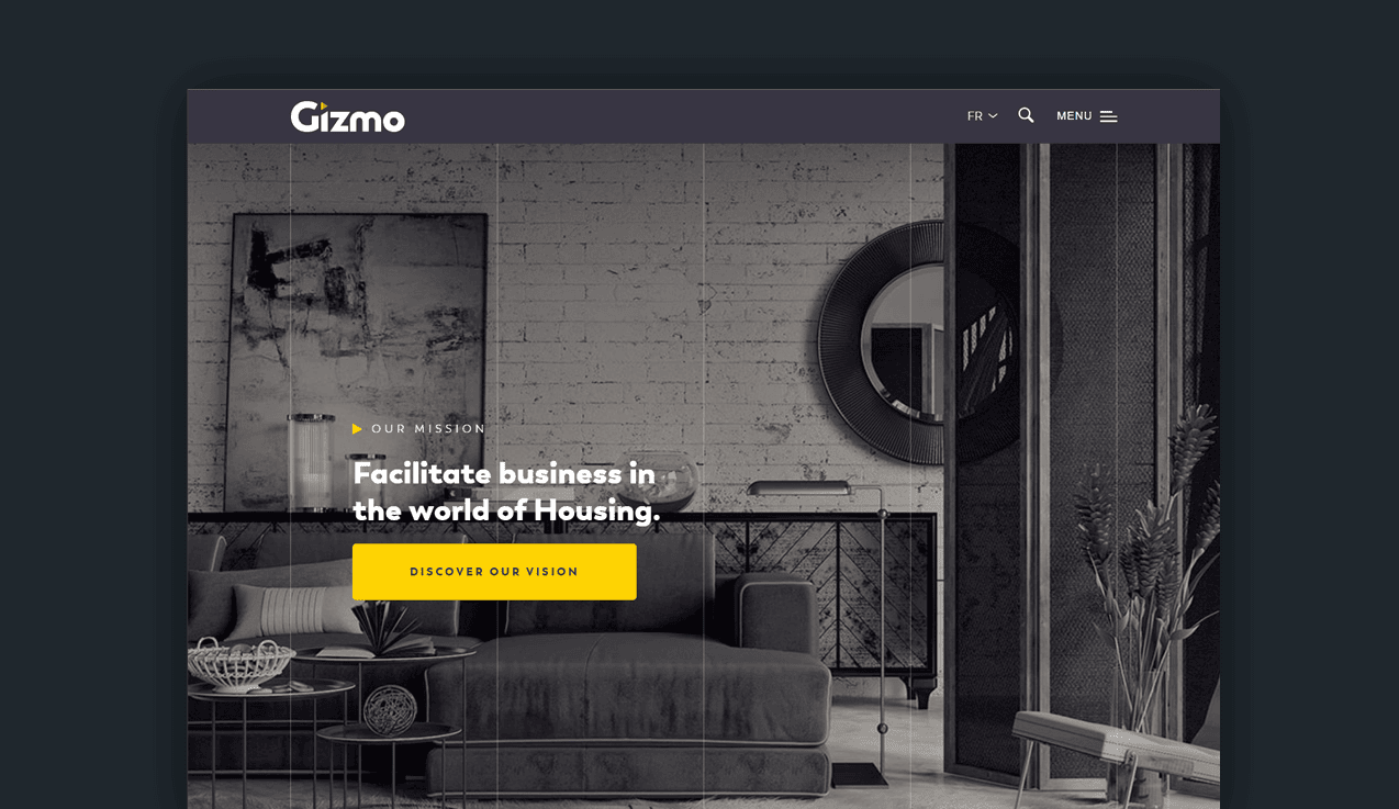
Gizmo is a French real estate showroom agency driven by exclusivity and trailblazing home tour technology.
Home buyers get to step inside each listing with an immersive video and 360 tours of the space.
“Open all doors” to video touring, as Gizmo redefines multiple listings' layout, staging, and online personality.
Customers are provided 3D glasses for the tours, adding that special element to your average home search.
Such software is available to host on your site but can affect loading speeds if not optimized correctly. G
one are the days of flat, basic home images; superior tech stands out and generates more leads.
Frequently asked questions
Is WordPress a good platform for real estate websites?
WordPress is a great option for most real estate agents. Hundreds of themes are designed specifically for real estate agency services or listing capabilities.
The main reason thousands of real estate professionals use WordPress is that they own their site. You'll have complete control and ownership if you keep your hosting provider up-to-date.
However, the element of control can also be a steep learning curve. The abundance of plugins and themes can leave agents at risk of attack. WordPress has experienced a number of security breaches over the years, leaving website owners vulnerable.
What does a well-designed website include?
The best websites for real estate agents include a variety of different features. Ultimately, the best designs generate leads. We think about interactivity, local content, client testimonials, and featured listings.
These elements will all have a direct impact on how well a website converts. In addition, you have to consider how well your CTAs are designed and how easy it is for a potential client to reach you.
Summary
You don’t need thousands of dollars to create a functioning, bustling real estate website.
There are countless website builders available for free or with a paid plan that’ll look like you’ve hired a UX designer.
Before you go live, mind your site’s responsiveness and organization. How fast is your media loading? Are your calls to action clear? Can normal human beings find what they need to find easily from your layout/menu?
So many factors play into a flawless site, more than we’d like to consider. There are many design elements: color theory, typography, brand speech and tone, imagery, and site capabilities.
Start small, and work big. Or hire an expert to streamline this process and take the headache out of website design.


